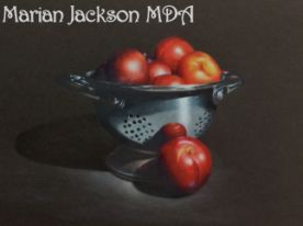
I have wanted to try Sanded or textured papers for a while so here’s my painting, it will be an Epacket later on. For now, I want to share my experience with you.
Because I work on the smoothest paper I can possibly find (Stonehenge) this was a huge change for me. Before I started, I took a kitchen sponge with a scrubby side (brand new, clean and used dry) and sanded the surface. (Sctoch Brite, non-scratch scrub sponge. It’s blue.)
I used my regular Prismacolors and found it layered nicely on the paper and blended well. The biggest problem I had was good clean edges – solved by using a Verithin in the same color. Because it’s sandpaper-ish, particles were kind of everywhere as I painted. Brushing off just smeared so after the first swipe I was very careful. I might be tempted to use a Swiffer in future. I think it might be gentler than my brush. At the end, the background was quite smeared but using the Factis Black eraser, it all came off. The surface is hardy, I did like that and I really like the color range. This is Sky Blue.
I could have used more layers to cover the texture but I rather like it. It seems more natural than perfectly smooth to me. I haven’t tried OMS or blender pencils on it yet – I wanted it to be a pure painting to begin with, then maybe later on I will experiment.
 Now available on my website:
 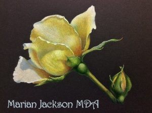 w Rose is my second project for 2015 on the Colored Pencils Club. I’m thinking also of the possibility of several background color choices. I didn’t want to get this too complicated as we have so many beginners subscribing, but I believe you will learn something regardless and it’s interesting enough for advanced painters. Always fun to put your own spin on an painting like this.